How Does Responsive Design Impact User Experience?
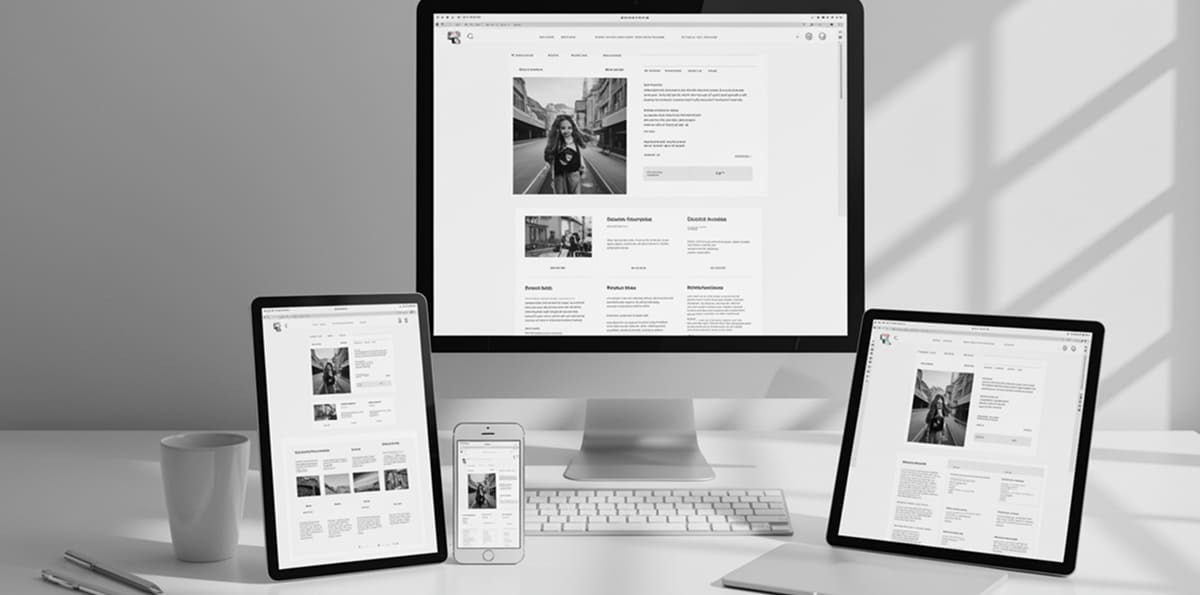
In today’s multi-device world, users expect a website to look and function perfectly whether they’re on a smartphone, tablet, laptop, or desktop. That’s exactly where responsive design comes in. It’s not just a design trend—it’s a fundamental approach that directly affects how users perceive, interact with, and stay on your website.


Responsive design is the practice of building a website that adapts automatically to different screen sizes and devices. Rather than creating separate versions for mobile and desktop, a responsive site adjusts layout, images, navigation, and content dynamically—offering a consistent, seamless experience.
Why Does It Matter So Much?
The short answer: User expectations have changed. People expect fast, clean, and frustration-free experiences no matter what device they’re using. If your website doesn’t meet those expectations, they’ll leave—and possibly never return.
Let’s look at the impact responsive design has on user experience in more detail:
1. Consistent User Experience Across Devices
Users often visit a website multiple times from different devices. Responsive design ensures that no matter the screen size, users experience your brand in a familiar and functional way.
- A user might start browsing on their phone, return later on a desktop, and make a purchase on a tablet.
- If the layout changes drastically or content is missing on one version, it breaks the trust and continuity.
2. Improved Navigation and Readability
On small screens, poor design choices—like tiny fonts, crowded buttons, or hard-to-use menus—create friction. A responsive design tackles this by prioritizing mobile-friendly layouts, readable text, and easy-to-tap elements.
- Menus collapse into icons (like the hamburger menu)
- Fonts resize proportionally
- Buttons are thumb-friendly, not mouse-dependent
This removes frustration and encourages users to spend more time on your site.
3. Faster Load Times and Performance
Responsive design usually goes hand-in-hand with mobile-first optimization, which emphasizes performance. Faster loading times directly impact user satisfaction and conversion rates.
- Lighter images and scripts load more efficiently on mobile
- Lazy loading can prioritize key content first
- Adaptive images prevent unnecessary bandwidth use
Slow, bloated websites lead to higher bounce rates—especially on mobile.
4. Better SEO and Discoverability
Search engines, especially Google, now prioritize mobile-friendly, responsive websites in their ranking algorithms. If your site isn’t responsive, your SEO will suffer.
- One URL across all devices makes indexing easier
- Mobile usability directly affects search rankings
- User engagement metrics (like bounce rate) also influence SEO
A well-optimized responsive site increases your visibility and keeps users engaged once they arrive.
5. Increased Conversions and Engagement
A seamless experience naturally encourages users to take action—whether it’s filling out a form, making a purchase, or reading more content.
- No pinching or zooming to interact with forms
- Clear CTAs adapted to all screen sizes
- Better usability leads to higher trust and engagement
In short, responsive design turns casual visitors into loyal users—and loyal users into paying customers.
Conclusion
Responsive design isn’t just about visual appeal—it’s about building digital experiences that respect your users’ time, habits, and expectations. If you want to deliver true value and stay competitive in 2025 and beyond, responsive design is no longer optional—it’s essential.